Audio Detection Assistant for Google Maps
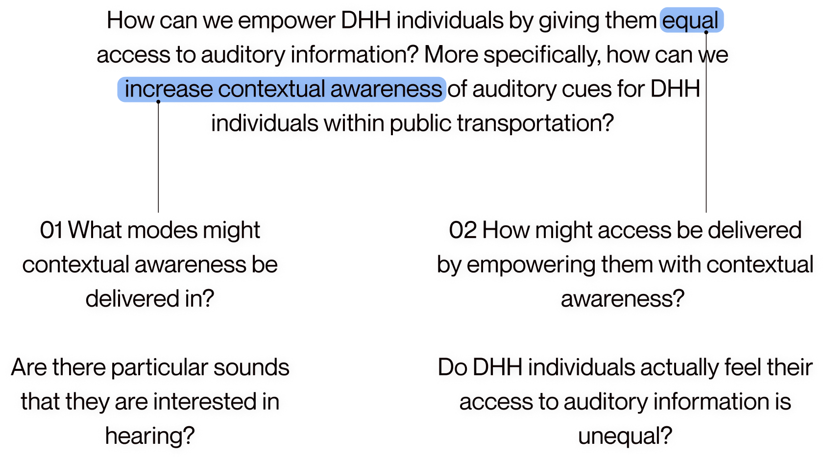
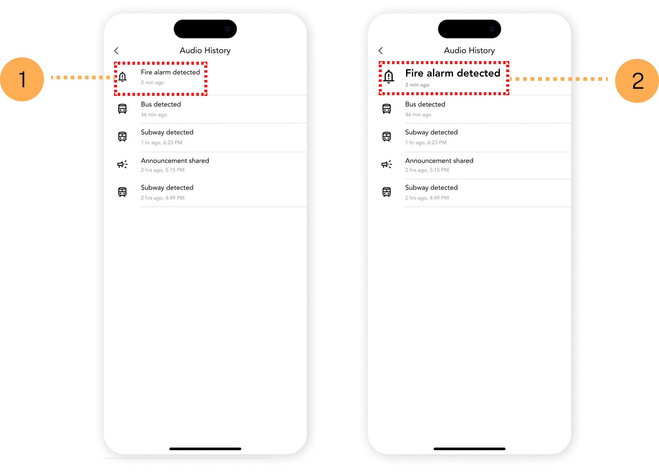
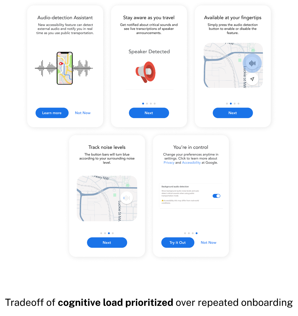
For Deaf and Hard of Hearing users, missed announcements can cause safety inconveniences. Here’s how we designed an audio detection assistant to increase awareness and trust
Timeline
Aug - Dec 2024
Tools
Figma
Notion
MS One Drive
FigJam
Team
Timothy Chiu
Disha Sikaria
Rachit Bhayana
Natalie Jarrett
Skills
Accessibility Design
Interaction Design
User Research
WCAG 2.1
Showcase of Interaction on iPhone ScreenInterface on iPhone Showcase
OVERVIEW
The Audio Detection Assistant is a proposed feature for the Google Maps experience for Deaf and Hard of Hearing (DHH) individuals that provides contextual awareness of critical audio cues
As a member of a team of four, I was responsible for the creation of design assets and components in addition to research responsibilities including, but not limited to conducting background research and usability evaluations.
SCOPE
Deaf or Hard of Hearing (DHH) individuals often encounter barriers to fully engage with their surroundings
The mission was to promote inclusivity and equity by raising awareness of the role auditory information plays in shaping accessible spaces.
RESULT
Real-time alerts for DHH users to stay informed about essential auditory cues while taking public transportation or walking
Showcase of Interaction on iPhone ScreenInterface mockup on iPhone for feature showcase
UNDERSTANDING
The DHH community had no control nor voice in what was being delivered....
"An enjoyable travel experience is one where I don't have to worry too much about where to go next. I find that time can be wasted when plans are not made ahead of the trip"
Image of sketched designs
Literature Review
Researchers emphasized the importance of visual cues and improved emergency notifications for enhancing accessibility.
Hearing from the DHH community
We conducted 8 semi-structured interviews with diverse participants, including members of or those familiar with the DHH community.
These interviews with experts highlighted systemic failures in accommodating needs for DHH users as systems were made.
This led to the problem statement that would inform the rest of the design research process...
THE GUIDING QUESTION
How can we empower DHH individuals by giving them equal access to auditory information? More specifically, how can we increase contextual awareness of auditory cues for DHH individuals within public transportation? 1. 01 What modes might contextual awareness be delivered in?  Are there particular sounds that they are interested in hearing? 2. 02 How might access be delivered by empowering them with contextual awareness?   Do DHH individuals actually feel their access to auditory information is unequal?
These methods gave insight to the frustrations that DHH users face which ultimately comes down to...
WHAT IT COMES DOWN TO
There was a lack of accessibility to announcements shared when taking public transit
Designing for DHH individuals neccessitates inclusive collaboration, creating accessible public spaces, and developing adaptable technologies.
EXPLORATION
Of 100 concepts that we ideated, one focused on the public transit experience stood out
We brainstormed 100 ideas which were then evaluated an refined into 5 strong themes.
Image of sketched concepts with highlighted one being the public transportation concept
Once the design concept was defined, we retraced ourselves back to our user group to ensure our initial design explorations matched their expectations.
LEARNING DIRECTLY FROM THE DHH COMMUNITY
2 participatory design sessions helped evolve our concept into designs via expert critiques
Recommendations focused on reducing text reliance, using visual symbols for alerts, and limiting cues to a small set of high-priority ones
Image of participant quotes from interviews, Participant 1: “Amazing that you’re focused on visualizations, I don’t think I can imagine looking down at my phone to read.” Participant 2:  “Consider five to seven cues, right now it seems like there are many focuses you are trying to account for.” Participant 3: “I like your idea for including many visualizations, I think that’d be really helpful.” Participant 4: “It has a wide scope, there might be too many different needs for different scopes.”
However, after detailing design concepts with other UX designers and researchers, I discovered that...
VALUE PROPOSITION
Designing an entirely new product was unnecessary. Users already relied on Google Maps
Before prematurely designing mid-fidelity concepts of our feature, we conducted a comprehensive audit of Google Maps to ensure the feature could be introduced where users expect its use.
DESIGN DETAILS
There were contextual nuances determining the optimal placement of our feature
This audit helped to identify events where the feature could be included. Here, the audio detection button's determinant location is based on the mode of transportation.
Image of interface iterations
TRANSIT JOURNEY NUANCE
1. When walking, audio accessibility button exists within compass UI of maps.
2. When using multiple modes, accessibility button exists elsewhere on UI.
With feature location situated, we could now focus on the conception of three key functions of our feature...
FEATURE DETAILS
Referencing past cues especially in case of missing announcements, with users citing the lack of visual signage as a pain point
Viewing past cues, whether due to the journey being inactive, or simply overlooking the notification.
Showcase of Interaction on iPhone ScreenInterface Mockup Showcase of Feature
Ensuring safety for transit journeys through visualization of alerts and announcements that appear seconds before the event occurs
Detection and transcription of alerts and cues, such as approaching trains, fire alarms, or announcements
Showcase of Interaction on iPhone ScreenInterface Mockup Showcase of Feature
Returning trust back to the DHH community through an audio feedback transcription via crowdsourced feedback from hearing individuals
The goal is to avoid misinforming users, a concern highlighted by a participant from our participatory design.
Showcase of Interaction on iPhone ScreenInterface Mockup Showcase of Feature
VALIDATING OUR DESIGN
We needed to make sure our product mirrored Google Maps UI design patterns and followed good design practice
Heuristic evaluations were conducted with three experienced UX designers and one accessibility design expert on our visual communication and consistency of our designs.
VALIDATION
There were minor inconsistencies, but overall the design reflected Google Maps standards
Areas focused on included evaluating the visual design’s adherence to established design standards and assessing whether it met the expectations of DHH users.
Image of heuristic evaluation forms, "We included 10 different criteria to which our system would be evaluated", "A high-level sub-criteria, giving us assessment of how successful our design was delivered, measured to design heuristics cited by Jakob Nielsen"
Below, are three design considerations that we addressed upon receiving feedback on our designs from experts.
ACCESSIBILITY
Color is not enough to convey information nor is it accessible, especially for colorblind users
Color indicators were replaced with audio bars that increase with background noise, an affordance to tell how close a transportation vehicle is to arrival at the stop.
Image of interface iterations "Initial Design - Audio levels defined by colors had no semantic significance Not easily determined what color is associated with an audio level", "Final Design -  Improved definition of differences afforded by audio spectrum differences Easily legible appearance of audio spectrum button"
RATIONALE
1. Not easily determined what color is associated with an audio level.
2. Improved definition of audio spectrum differences, that are 508-compliant.
PRIORITIZATION
Recent audio history should be prioritized as it was previously mentioned by two DHH users that they easily missed announcements
Alerts were highlighted by bolding and increasing the size of text to emphasize the most recent event.
Image of interface iterations "Initial Design - Most recent audio cue did not have significance Experts from heuristic evaluation could not determine use case for this screen" "Final Design - Most recent history given bolded, larger appearance Gives significance to recent audio cue in history for recall"
RATIONALE
1. Formerly, text size and font weight, equal to other notifications.
2. Most recent notification should INFORM DHH user on next steps, hence bigger and bolder font.
The original flow let users view audio alert history, but alerts lacked prominence, and timestamps were unclear.
COGNITIVE LOAD TRADEOFFS
The feature is unfamiliar, but too much onboarding would dissuade new and current users
Google Maps has over 2 billion active users globally, a reminder feature might be beneficial but it'd be disadvantageous to Google Maps as a product due to cognitive hindrance.
Image of interface iterations "Design Considerations - Experts suggested incorporating reminders of onboarding features throughout the transportation journey. However, repeated reminders could increase cognitive load and potentially hinder the experience."
IMPACT
Globally recognized proposed design for Google Maps that was accepted to CHI at an 18.7% acceptance rate that empowers DHH communities with an entrusted service to their needs
Many thanks and gratitude to the DHH community members and accessibility experts who approved of our research design!
image of data visualization component assets
REFLECTION
Implementation of AI 
All things considered, a predictive AI model for cues could be more accurate in determining lower-priority cues of information that can be helpful for a public transit journey using Google Maps.
Incorporating Surveys for Broader Feedback
While one-on-one sessions with a small group provided valuable insights, we recognize the need for broader data collection to assess how well it ascribes to the DHH communities overall needs.